You are using an out of date browser. It may not display this or other websites correctly.
You should upgrade or use an alternative browser.
You should upgrade or use an alternative browser.
Fluctuating temperatures
- Thread starter Michel Kraaij
- Start date
Bryan Mayland
TVWBB Hall of Fame
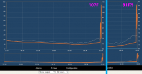
That's the temperature fluctuating. When you hit refresh, it pulls from the database which stores the average value so it gets smoothed out. The bits at the end come from live updates so they display the actual values.
If there's excessive noise in the system, there will be a yellow or red squiggle icon in the bottom left corner of which probe is noisy. You can bring up raw noise graphs to check for noise in the readings by clicking the squiggle icon or pressing 'N' on the keyboard while logged in.
If there's excessive noise in the system, there will be a yellow or red squiggle icon in the bottom left corner of which probe is noisy. You can bring up raw noise graphs to check for noise in the readings by clicking the squiggle icon or pressing 'N' on the keyboard while logged in.
Michel Kraaij
TVWBB Member
The only 2 icons I see are the 'Save graph image' and 'Save CSV data' icons.If there's excessive noise in the system, there will be a yellow or red squiggle icon in the bottom left corner of which probe is noisy. You can bring up raw noise graphs to check for noise in the readings by clicking the squiggle icon or pressing 'N' on the keyboard while logged in.
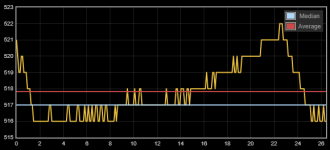
If I pull up the noise graph and cycle through the different views, this one is the one with the biggest fluctionations. But I'm not sure what this graph represents and how I should read these values.
Bryan Mayland
TVWBB Hall of Fame
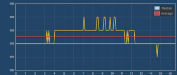
Well it depends on which input you've got selected when you see that. If it is FFB (Fan Feedback) then that could be normal but I don't think that's a fan based on the waveform. If it is a probe that's bad because it is showing that over a 26 millisecond period, the temperature changes significantly because it should only be 0-2 counts different across that range. How much temperature that corresponds to depends on the probe but it should look like this, although even this is on the high end of a normal amount of noise:
You can try turning on the Power Line filter because your noise seems to almost track power line fluctuations, but usually this comes from the power outlet itself.

You can try turning on the Power Line filter because your noise seems to almost track power line fluctuations, but usually this comes from the power outlet itself.
Brian,
I have seen that before. It looks like to me when I experience this, the graph looks like it instead of plotting maybe once per minute, it plots lets say 60 times per minute. I never associated noise with this when I brought up the noise graph, so I knew on my temp probes were not causing issue. To get out of this mode, I would just switch out of 1hr mode, let it run for a minute or two and then back to auto and the issue was usually gone. I have only experienced this when I was using the 1hr time base of the graph.
I have seen that before. It looks like to me when I experience this, the graph looks like it instead of plotting maybe once per minute, it plots lets say 60 times per minute. I never associated noise with this when I brought up the noise graph, so I knew on my temp probes were not causing issue. To get out of this mode, I would just switch out of 1hr mode, let it run for a minute or two and then back to auto and the issue was usually gone. I have only experienced this when I was using the 1hr time base of the graph.
Bryan Mayland
TVWBB Hall of Fame
Thanks for the report, but 100% it isn't a software problem, that's the actual plot of the temperature. If the temperature is changing fast enough it looks all squiggly like that because the graph contains every temperature update received. Changing the scale of the graph throws all those out, and pulls them from the database again which contain averages so magically the temperature looks smoother. It will happen with any graph scale, although it is likely more noticeable on 1hr, 6hr, and 12hr graphs because they refresh less frequently which allows the squiggles to build up for longer before they are cleared by a graph refresh.
I tried to simulate it by real quick blowing hot air on my probe, but got a little over-zealous so the temperature shot way up. In any case, you can see that the graph has a high point around 107F then magically it is less bad, only peaking at 91F. It also is descending to in the first graph, but rising in the second graph, because there's no average for the current period yet so the current temperature is higher than the average of the last period but lower than it was a few ticks ago (which we don't have any more). It is the same thing you're seeing, where the temperature is bouncing around a lot but when it refreshes the bounces are smoothed out by the averaging.
This can also be caused by the temperature actually changing and you'll see a ton of it on a bare thermocouple because it is so sensitive to the slightest waft of heat blowing by.
