Yes the graph shows "output" which is the same as "damper percentage". Blower speed is easily identified by knowing that it is scaled linearly. If you say max blower speed 50%, and the output is 50% that means the blower is on 25%. Having them both on the graph is redundant because they have identical curves, just one would be a scaled version of the other. The min speed nothing really understands because it happens internal to the HeaterMeter and isn't output anywhere. It also doesn't matter though because 10% is 10% regardless of if it on 1 second and off for 9 seconds, or on for 2 milliseconds and off for 18 milliseconds. The only thing changed by "min fan speed" is how long the pulse output period is, which users should not burden themselves with.
The little bar above the graph that shows the output actually will display output as well as fan speed (just scaled) in a slightly different color. It isn't very differently colored because adding contrast increases the amount of perceived information, which is already pretty dense.
The blower settings are documented in the "Help" link on the configuration page which leads to Configuration Webui Documentation wiki.
Bryan, I realized that I'm screwing up the other thread so I thought I'd bring there here and start something we can talk about instead.
I'm not sure I understand what you're telling me here. I can't understand how the curve is the same between the two if one is on and one isn't. In other words, if I have the fan set to "on at max only" then the scenario exists where the damper would be opening and closing as much as all the way closed or all the way open but the fan may never actually turn on if the damper has the temperature under control right? Wouldn't that create different output curves between the two?
Now that Ralph posted the code to separate the damper and blower on the UI, I've redlined a picture to help discuss:
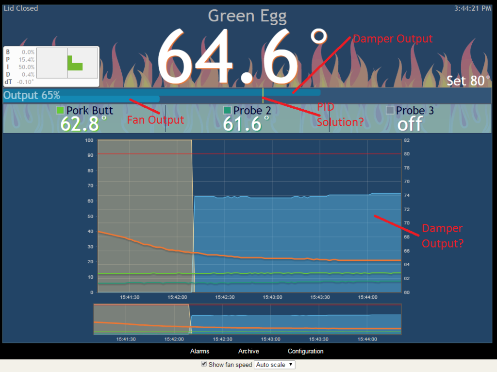
The way I understand this is that the top bar shows "how open" the damper is as it's controlling the servo and the bottom bar is showing fan speed in percentage from 0-100. I'm pretty sure that other little line is the solution the the PID equation displayed in real time--I thought that was the damper before seeing the split code that Ralph posted up.
So that means that the chart we're seeing is either:
a) displaying the damper output only
b) displaying the fan output only
c) displaying the combined output of the damper+fan
d) I still have no idea what's going on
I think the right answer here is "a" and it's showing the output of the damper only and the fan isn't being represented at all. Now that's ok, but wouldn't it be valuable to see both the fan and damper in that chart at the same time for slow and low cooks? In other words, if my damper is working properly and the fan isn't turning on at all, that's great to know. But if the fan is having to run a lot while the damper is getting close to being wide open, then that would indicate that the fuel is running low and it's time for a lid open and refuel I'd think?
Or, if I was just watching fan control, that may be valuable too as it assumes that the damper is doing exactly what it is supposed to be doing but if I see the fan start to run up, then again the fuel might be running low. Is that something that can be selected in the with the user CSS coding? Can I display either "a" or "b" or even possibly do them at the same time in different colors?
Ralph, thanks for that piece of code.
")