More demos, the Sub-Micro Unusably Small Heatermeter Indicator


Bryan Mayland

TVWBB Hall of Fame
SMUSHI is another demo of the HeaterMeter client library, now with ESP32 support.
DSC07423.JPG

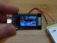
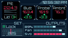
I needed to make sure the client library worked on ESP32 and all the test devices I have are already doing something so I bought one of these LILYGO(R) TTGO T-Display ESP32 mouthfuls with 1.18" IPS TFT display. Spent Sunday afternoon doing a mockup of "What if there was BBQ on the Rocinante spaceship?"
mockup.png

When it arrived I laughed at how small the screen actually is. The pixel density, viewing angle, and color of the display is just insane for the $13 I paid for this little thing. I mean the original Macbook Retina has about the same pixel density! Unfortunately, it is so small I can't see a thing on it. I spent Tuesday with a magnifying glass and my glasses lining up all the UI elements. Source code is available on GitHub.

The best thing about the source code is that there's about 5 lines of HeaterMeter stuff and then 350 lines of drawing code. I spent 1 minute getting it connected to HeaterMeter and all day and night drawing and uploading pixels with a magnifying glass.

It can run on a battery as you see, it also contains a lipo charger circuit. This is probably the end of the road for this design and I highly discourage anyone from duplicating this, as the pictures don't convey just how tiny and unusable this is. You thought 13 characters for probe names was restrictive in the webui? Hold my beer, this maxes out around 5. There's also no control or anything, it is just another display like the HeaterMeter Monitor.

What fun but ultimately useless stuff can YOU do with the HeaterMeterClient library?
 
I'm not sure how easy it would be to get working on that, since the client library relies on AsyncTCP and the espressif HTTP client and WiFi libraries. It would work with a WT32-SC01 probably, but building stuff with parts on hand is always more fun (although it can take a lot longer). Heck even that WT32-SC01 might need a lot of work due to having some sort of "drag and drop UI" firmware on it, so you'd have to scrap that.
 
haha yeah, that's what I started by google image searching to see what design aesthetic I could steal.

It is really does look amazing, the display is really really good (apart from some flicker when updating). If it was like 2.4" it might actually be usable, but every 2.4" TFT I've bought for testing has just been absolute garbage unless I want to pay $40+ a screen. The T-Display is a fantastic bargain but I can't imagine putting more than like a single value with a label on it at once without having to wear +2.0 readers to make it out.

I've poked around their website and can't find anything that looks like a larger module that still looks as good. I guess at the higher screen size the number of pixels you've got to push over SPI to refresh it hits the point that it looks like an 8MHz atmega taking half a second to refresh the screen.
 
I can't stop playing with this thing despite the fact that I can't read it at all.

Pushed some changes so that the compiled-in wifi information is only used if you hold the right button, so that you don't have to edit the source every time to change it from connecting to "network". That means the "rotate display" button is now the left button, and holding this soft powers off the module. It still pulls about 0.3mA when powered down so it will still eat a small battery in no time.

I also optimized the paint routines a little so the Setpoint area and Output areas are only drawn if the values change, which means it can draw in 12ms instead of 17ms.

I think that's as far as that's going to go unless I get some lasik or something to be able to use it.
haha, is there a similar type display you can get that's bigger?
 
I've looked but every one I've seen/bought looks absolutely terrible. Usually they are TN-TFT and have a viewing angle of like 5 degrees before they start turning black and inverting. Most are "6 o'clock", which means they're for portrait display mode and they're hard to read if turned landscape. I haven't tried anything costing more than $20/pc though, since at that price you might as well just get a Amazon Fire Tablet for $50 (or as little as $30 sometimes). That would give you the entire webui with touchscreen, on a 7" IPS display, and a battery that lasts for hours.

I started writing a Touchscreen TFT UI for HeaterMeter that hooked right to the GPIO header of the Pi and the performance was pretty good but it looked so awful I abandoned it after a few weeks of work. I haven't been able to find any TFT that is worth buying when compared to a cheap tablet.

I might consider writing a webui home page that uses this style though, but I'm not sure I like it that much.
yeah, or even an old smartphone that's laying around. I built the current MeterMonitor because I thought it would be a decent "at a glance" device. I feel like I'm staring at the phone on long cooks in the house lol. Otherwise I stick the probes in for the Thermoworks Smoke (older one from my Dad, has the remote display) as a backup & can glance at the remote for temps.

Any chance you could write up a mobile friendly site at some point? I know you were looking to migrate from LEDE & that'll be some doing. I can't code much but more than happy to alpha or beta test lol
 
Yup someone suggested a giant (2" high numbers) 7-segment display a few years ago and I said that it was a fantastic idea, but then found that big LEDs cost like $10 per number and noped right out of it. I still liked the concept of an always-on at-a-glance display so I hoped that if I made the library and someone saw how easy it was to make, they'd make one and show all of us how awesome it is. I plug the HeaterMeter Monitor into the outlet next to the door going to the grill so I can look at it from the kitchen or the couch and see how things are going. It really is perfect because it is bright and simple.

As far as a more mobile friendly site, I'm not sure what can be made to make the home page more easily digestible. The home page was designed to be tablet-friendly at least, but it isn't very easy to do anything with it other than look at it and change the setpoint (well, that's the only features the original page had, haha). If you turn your phone sideways, you can see all the temperature values and output bar (or even vertically really). If you want something less cluttered, there's the "Low-fi home" link on the bottom of the page that has a more streamlined view. Other than those two I have zero ideas for a better layout unless you want the boxes to be colored or something like this

screen-1.jpg

If you mean all of the webui including the configuration page, alarms page, etc, then that's on the TODO list. I've gotten started 3 times writing a single-page website that has all that integrated, but 3 times I've been pretty put off at how ugly it was coming out because I have virtually no artistic still. If you have design ideas I'd love to hear them and maybe that will spur the innovation. If you have ideas, please start a new thread with them though because I'd lose them if they were in here.
 
@Bryan Mayland yeah, I keep forgetting about the LO-FI site lol. I use the app too. Even sideways, the page doesn't seem to fit all that well to me & the download graph/csv buttons (LO-FI link too) at the bottom are hard to tap on the phone (and I have a iPhone 12 Max). Shaded boxes would be great, at least for me, I named the probes red, green & blue so I can label them with the little bands to keep track of them. I can try to mock up something and start a new thread when I get a chance (I don't want to sound like I'm griping and put you off) but simple like what Thermoworks does would be helpful, I think (and this is actually their app, but the general premise is what you were hinting at above versus the smushi layout).

Signals_generic-01.jpg
 
So numbers twice the size they are in the Lo-Fi Home? That's not much different than what we've got already. I wouldn't add the High/Low/Max/Min for sure, that's some useless info. I'd also be wary of making something look too much like a commercial product. "But it is just a list of a few numbers" you say? Thermoworks might have a patent on displaying a list of grill temperatures published from a cloud platform on a mobile device. :D
 
So numbers twice the size they are in the Lo-Fi Home? That's not much different than what we've got already. I wouldn't add the High/Low/Max/Min for sure, that's some useless info. I'd also be wary of making something look too much like a commercial product. "But it is just a list of a few numbers" you say? Thermoworks might have a patent on displaying a list of grill temperatures published from a cloud platform on a mobile device. :D
haha, though there's so much prior art out there & several companies doing the same thing with competing devices, so I'm not sure who would own what there. I didn't say copy it verbatim! a clone of the smushi page on a bigger screen wouldn't be bad...
 
Now that I've seen this I've realized that I want an apple watch complication so on long smokes I can just tap my wrist and see what the pit is doing.
 
For Beltalowda!
Yes, boss man!
Now that I've seen this I've realized that I want an apple watch complication so on long smokes I can just tap my wrist and see what the pit is doing.
That's why there was a Pebble app! It was awesome to be able to just look at your wrist and see what's going on. Does the Apple Watch actually let you do stuff and draw on the screen? It seemed most wearables were leaning away from that and just going to 1st party only apps running on them.
 
That's why there was a Pebble app! It was awesome to be able to just look at your wrist and see what's going on. Does the Apple Watch actually let you do stuff and draw on the screen? It seemed most wearables were leaning away from that and just going to 1st party only apps running on them.
Not exactly, you still have to have an iOS app with WatchOS support and have the app installed on your watch. However there is now a HomeAssistant Apple Watch Complication that can display arbitrary data, so if I could get the data into HomeAssistant I could likely get it onto a watch face.

My HM is a very old build (like one of the early Pi2/3? ones) and I haven't dared update the firmware in about 6 years because it works so well so I'm not even sure what new bells and whistles the firmware supports but I bet if it talks to MQTT or something it would be doable.
 
HomeAssistant Apple Watch Complication
Haha I thought this was a typo of "companion" or something but holy cow they really are called complications.

There is a Home Assistant setup I've seen for pulling data from the MQTT stream, so sounds like that would work. MQTT isn't very well integrated into the webui yet, but I hear it works once you add a line to rc.local.
Cool, I guess I should see about trying to upgrade mine then. :)
 
Yes, boss man!

That's why there was a Pebble app! It was awesome to be able to just look at your wrist and see what's going on. Does the Apple Watch actually let you do stuff and draw on the screen? It seemed most wearables were leaning away from that and just going to 1st party only apps running on them.
I've been helping a friend of mine keep his pebble alive with printing the side buttons when he needs them. maybe ask the person that wrote the HM app for iOS to see if they can add the Watch to it?


Back
Top